Year :
2025
Industry :
UX Design
Team Size :
3 Members
Project Duration :
10 weeks
MEEA - Menu Concept
Product Prototype, Design
2025
UX Designer · UI Designer

Year :
2025
Industry :
UX Design
Team Size :
3 Members
Project Duration :
10 weeks


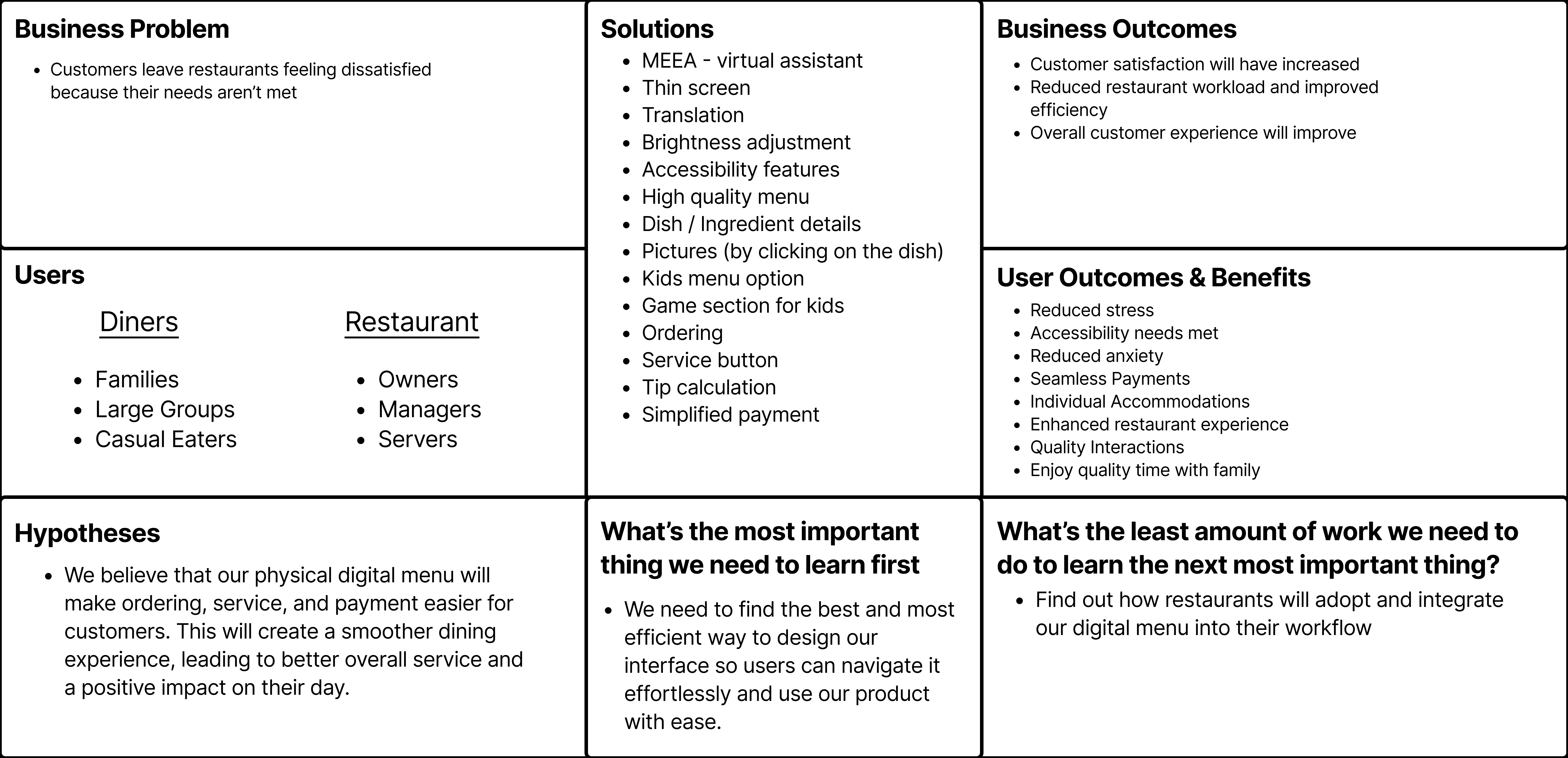
PROBLEM
Restaurant Guests leave feeling unsatisfied when their dining needs aren't met.
Many restaurant customers leave feeling unsatisfied because their needs ordering, communicating, and general knowledge about their food aren’t properly met, leading to a disappointing dining experience.
SOLUTION
Give Guests More Control, Clarity, and Confidence While Dining

Menu Browsing / Disovery
Explore the menu with clarity and confidence, without interrupting the moment.
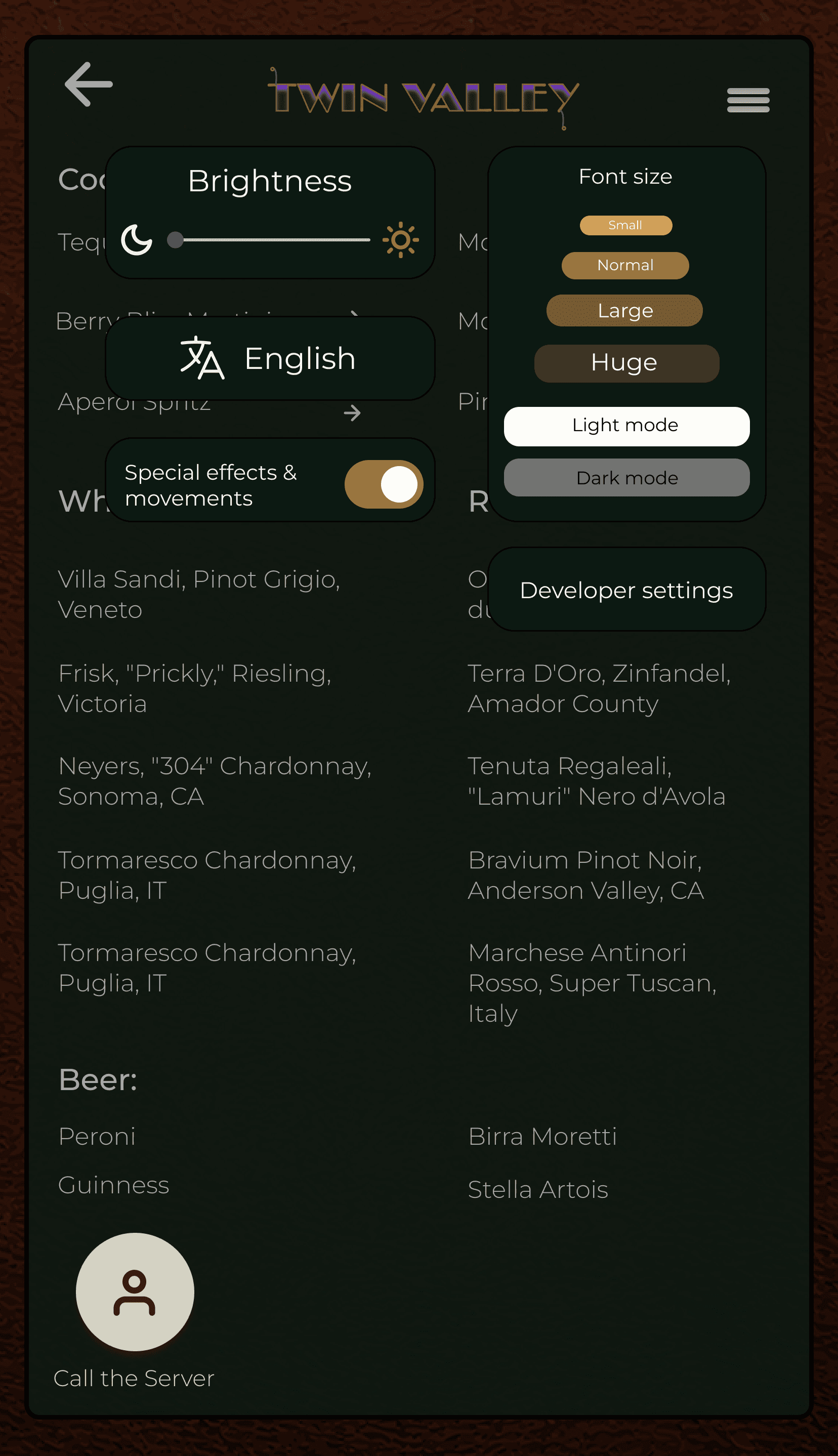
Accessibility & Display Settings
Adjust the menu to match your comfort, from lighting and language to motion and visibility, directly at the table.

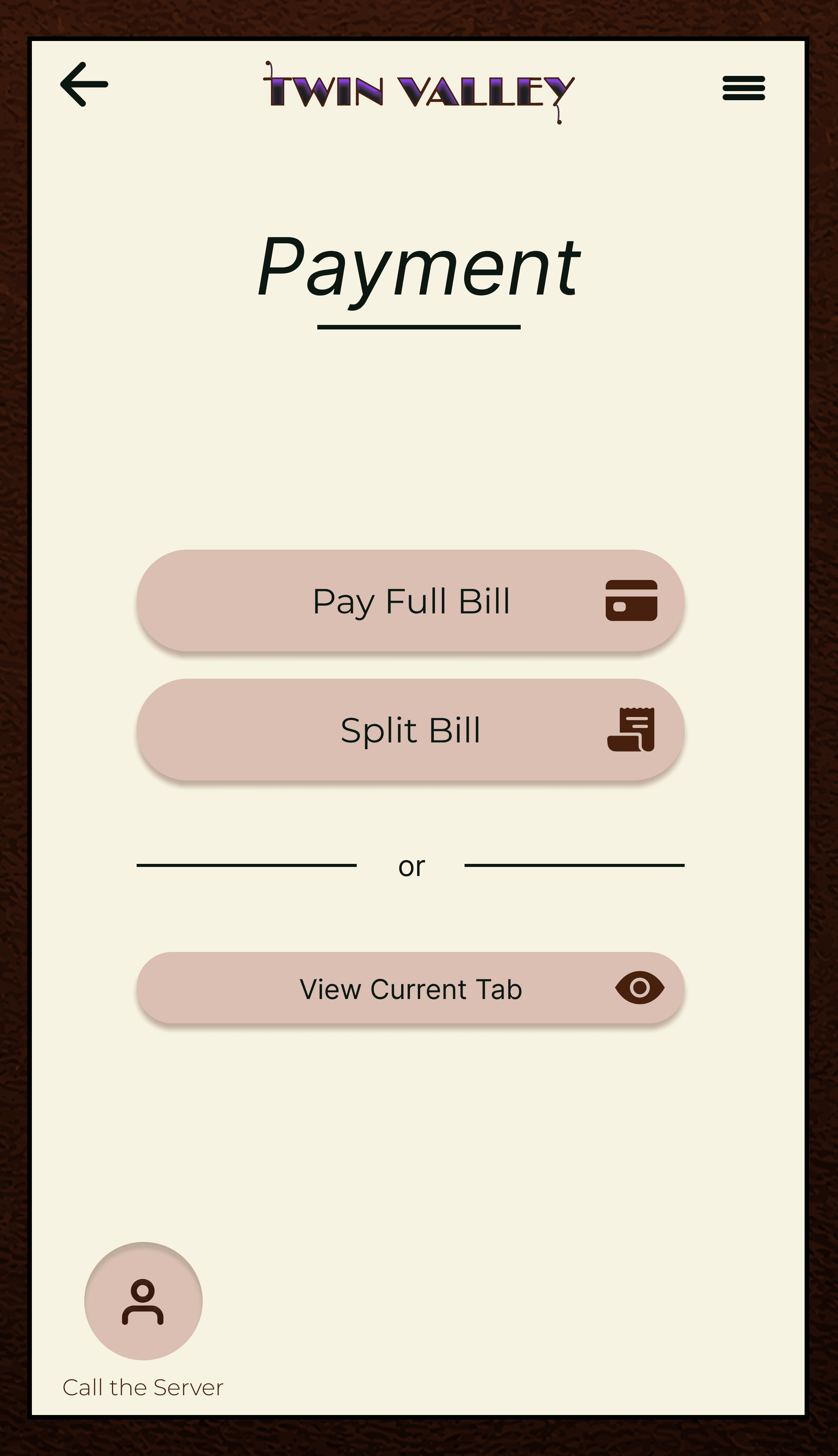
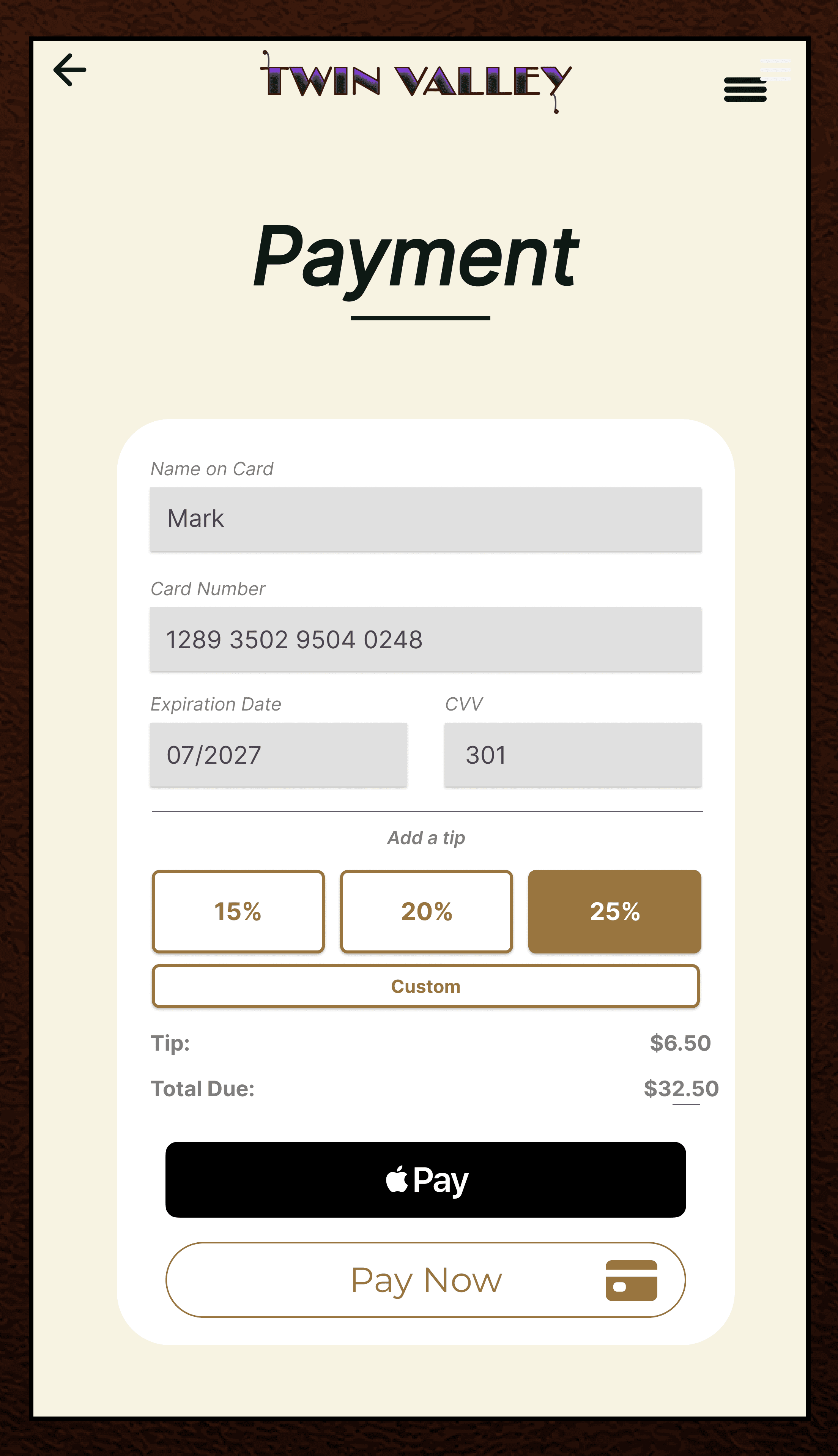
Payment & Checkout
Complete the check with clarity and ease, without disrupting the flow of the meal.
EXPLORATION AND DIRECTION
Exploring how technology could improve the restaurant experience
We began by broadly exploring the restaurant industry and asking ourselves "how might technology improve the dining experience while maintaining familiar patterns of interaction"?
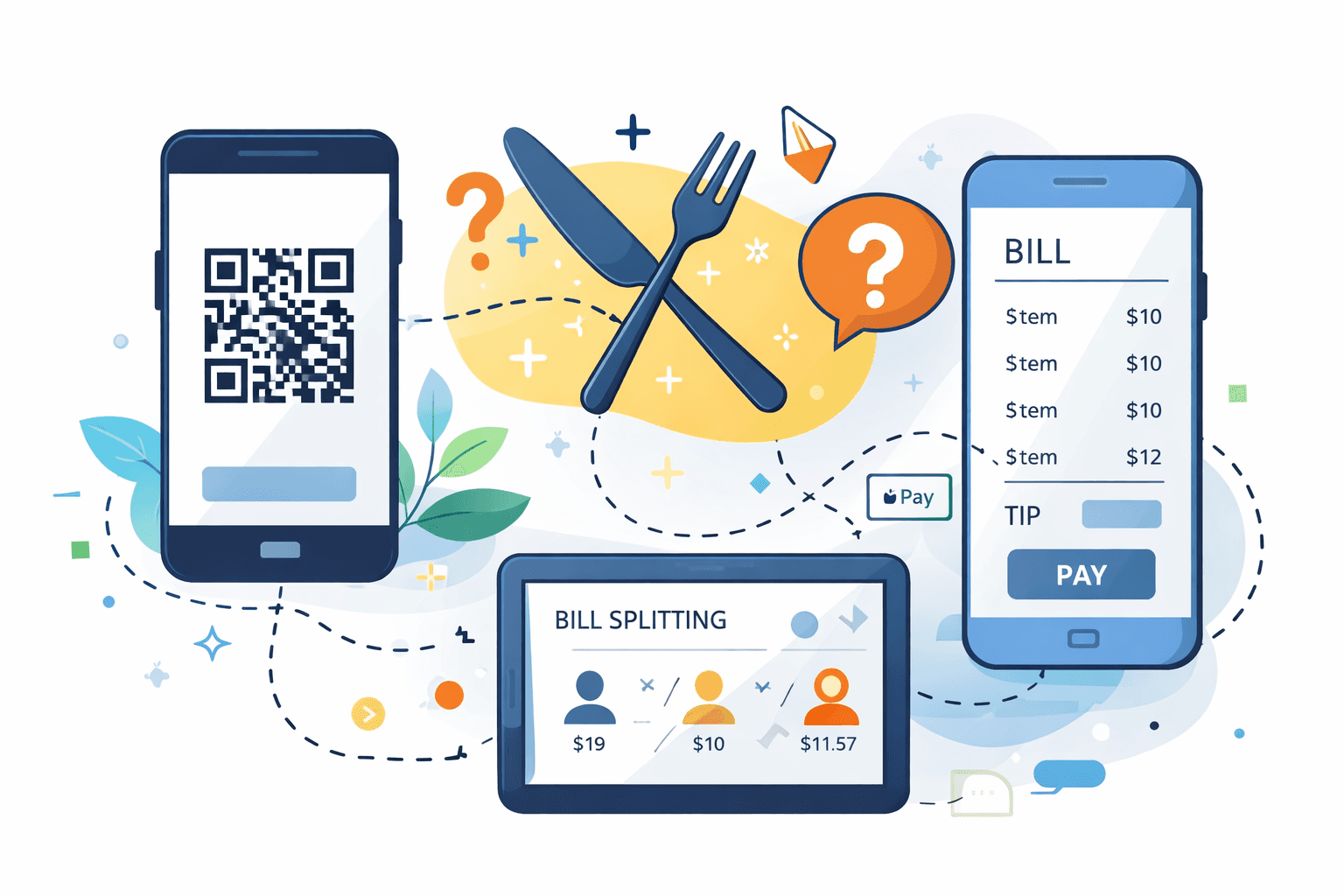
Our early concepts focused on mobile-based solutions, including QR-code payments and phone-driven bill splitting. These ideas aimed to reduce friction around payment and make group dining more seamless.
USER INTERVIEWS + INSIGHT SWITCH
Research reveled tension between convenience and presence
Through interviews and additional research methods, we uncovered a recurring theme:
many guests felt uncomfortable using their phones during meals.
While digital tools were often introduced to make dining more convenient, many guests described moments where these interactions pulled attention away from the table. Rather than supporting conversation, phone-based interactions frequently disrupted it.
Guests consistently expressed that phones often:
Distract from conversation
Feel socially inappropriate at the table
Interrupt the natural flow of dining together
DESIGN RESPONSE
Embedding a digital device inside a physical binding
In response, our team shifted toward designing a dedicated physical and digital product. Creating a menu that lives on the table itself.
COMPETITIVE LANDSCAPE + OPPORTUNITY
Industry norms help explain why this tension persists
Our analysis showed that many existing solutions are designed to optimize efficiency, speed, or transactions. While effective in operational contexts, these systems frequently depend on guests using personal devices during meals—reinforcing the same distractions surfaced during our research.
Recognizing this pattern clarified an opportunity: to design a solution that meets modern dining needs while reducing reliance on behaviors guests already find disruptive.
The Final Designs

Personality Traits
✨ Charismatic with high expectations
📱 Business-focused, detail-oriented, efficiency is key
🎨 In another life, he wishes he went to interior design school — strong respect for the art of the restaurant
Goals and Motivations
✅ Impress his family, friends, and clients with the hottest dining on his dollar
✅ Be able to cater to the needs (allergies, preferences) of multiple people at the table at once
✅ Have good timing and interactions with servers
Frustrations & Pain Points
❌ Not being able to reach the server when he needs to ask a question
❌ Lack of menu accessibility for his different guests
❌ Feeling out of control, being misinformed or uninformed about mishaps
MIKE
USER PERSONA
FEATURES + TESTING
Designing features that support clarity, comfort, and accessibility
The following features were intentionally designed to support a wide range of guests and dining scenarios.

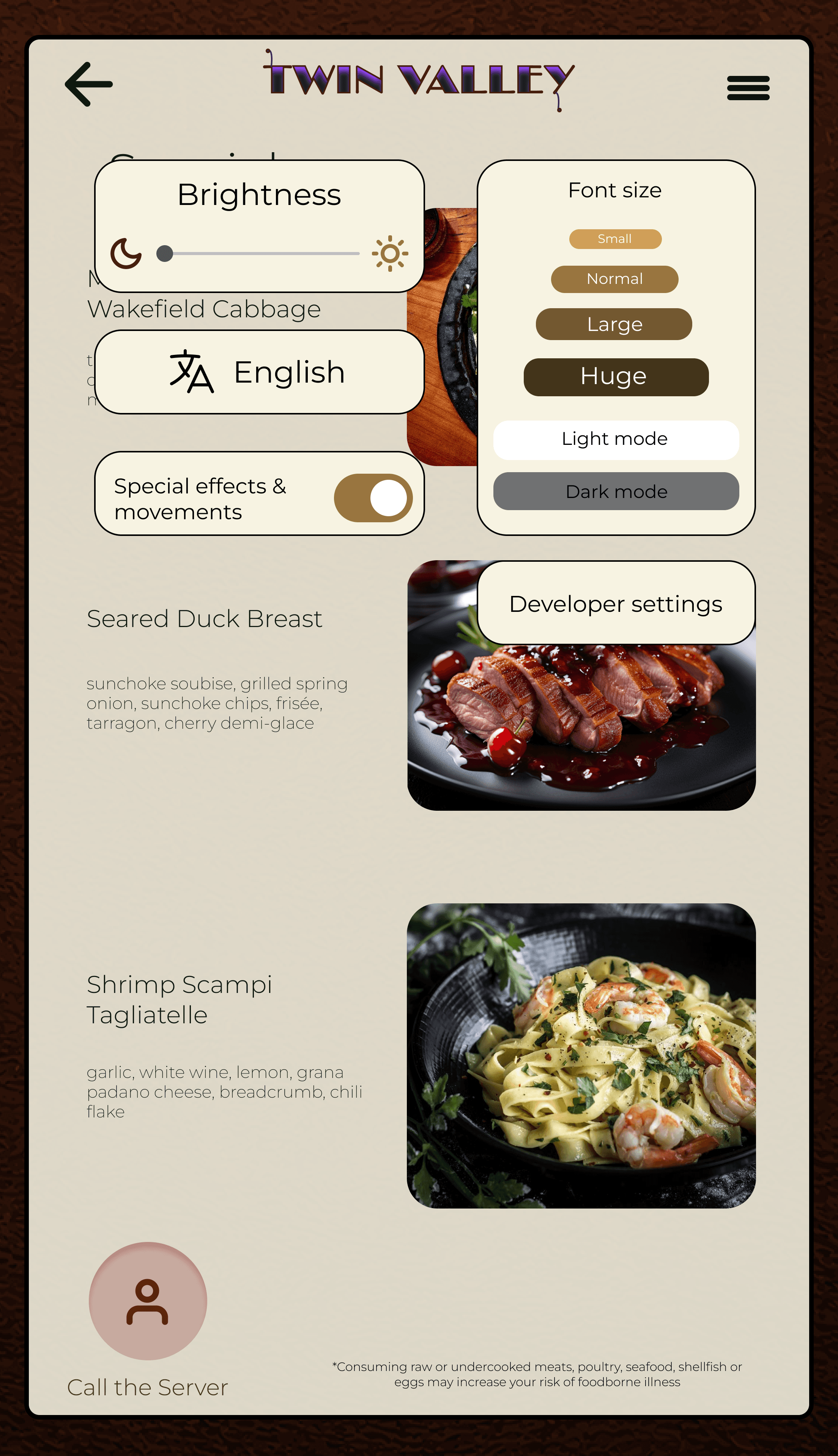
Accessibility & Display Settings
FEATURE 1
Light mode and dark mode
Adjustable screen brightness
Language selection
Optional visual effects selection
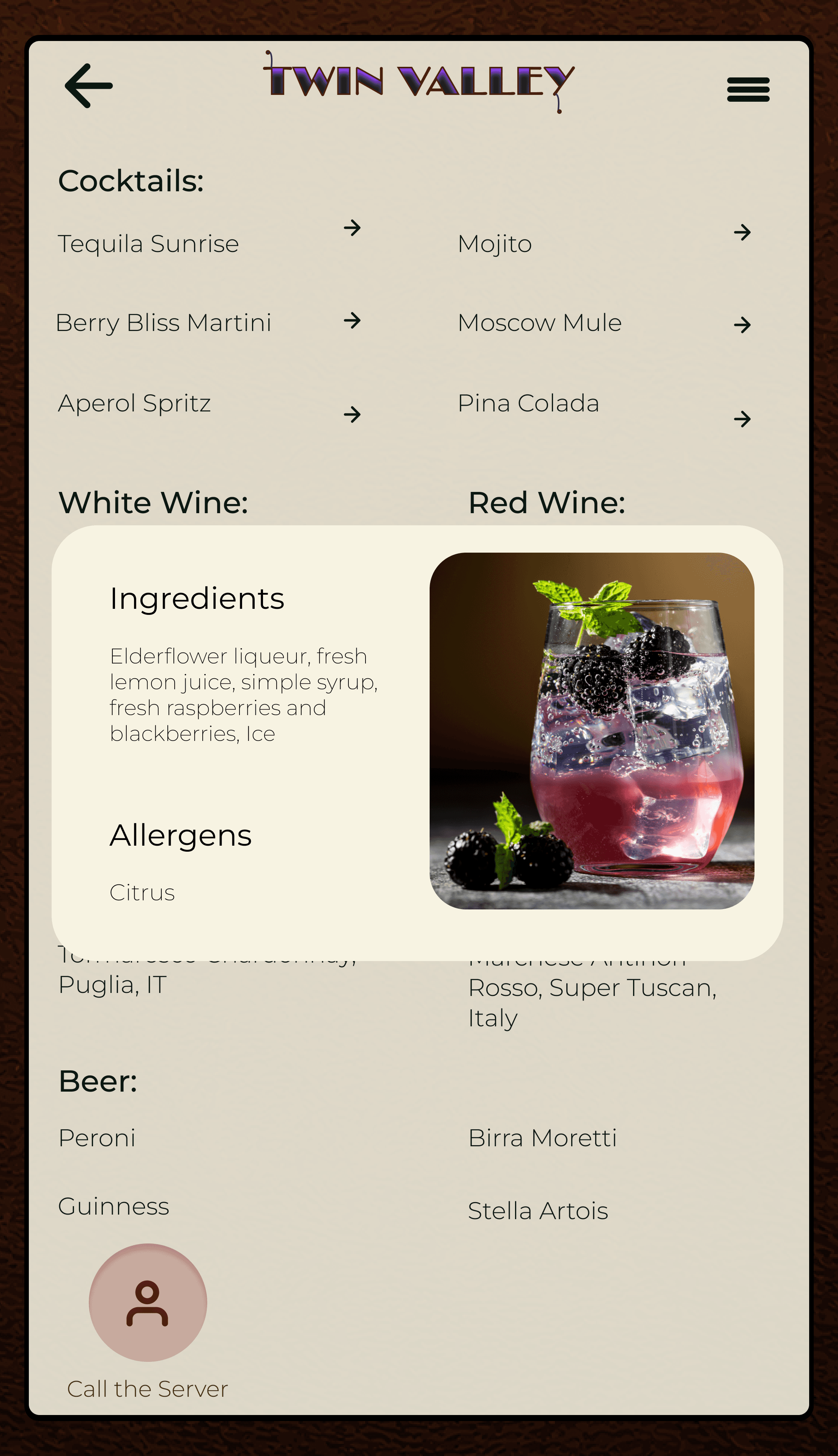
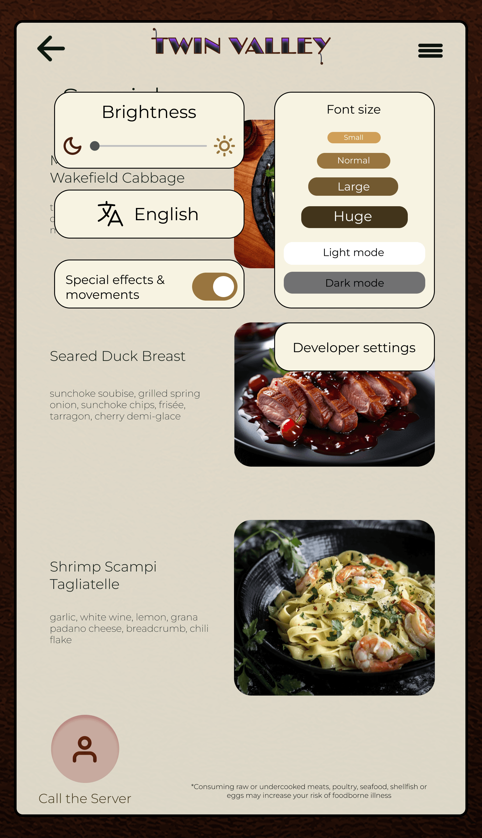
Dish Preview & Transparency
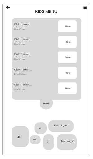
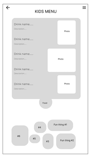
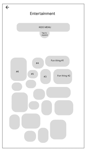
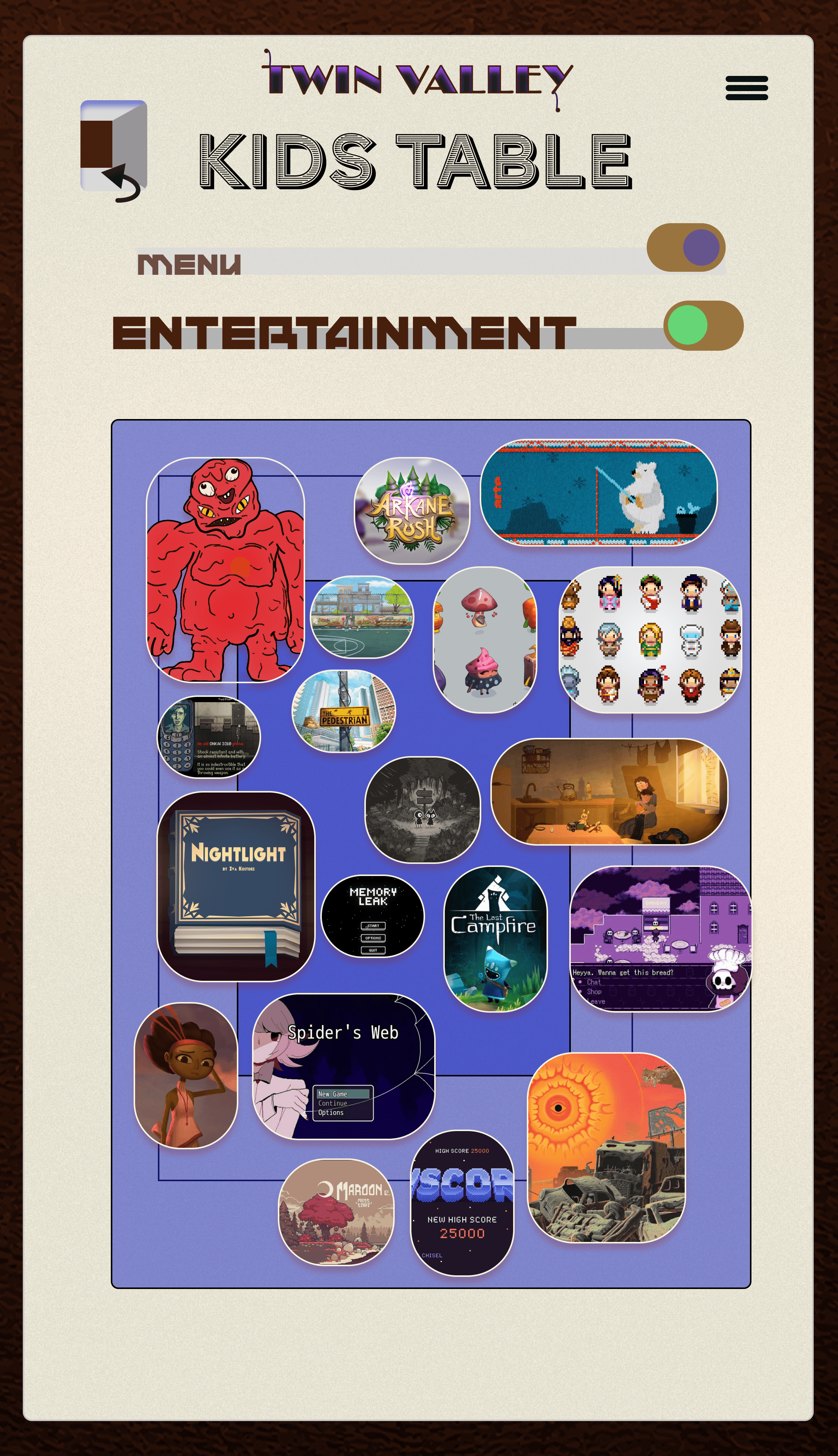
Interactive Kids Menu
FEATURE 3
Simple games and playful interactions
Visual aids to help with decisions
A dedicated experience for children

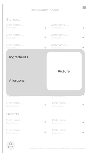
LOW-FIDELITY EXPLORATION
Exploring structure and flow through early wireframes
These low-fidelity wireframes were used to explore layout, hierarchy, and core interaction flows.
Style Guide
FEATURE 2
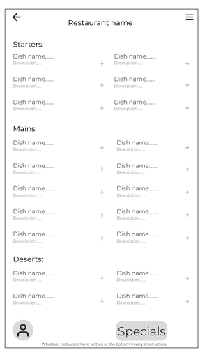
Visual preview of dishes
Clear descriptions and ingredient context
Reduced reliance on server clarification